
Rebranding BC Used Oil into
Interchange Recycling
Interchange Recycling
Brand Strategy
Brand Writing
Logo & Brand Identity System
Website Redesign
Awareness Campaign
Despite 20 years of success, the BC Used Oil Management Association brand had barriers to its growth. Their name was too regional and too specific about oil when they collect other materials. Plus, ‘Management Association’ wasn’t very inspiring.
A new brand needed to better reflect their operations and lean into how they help businesses and industry achieve better environmental outcomes for everyone.
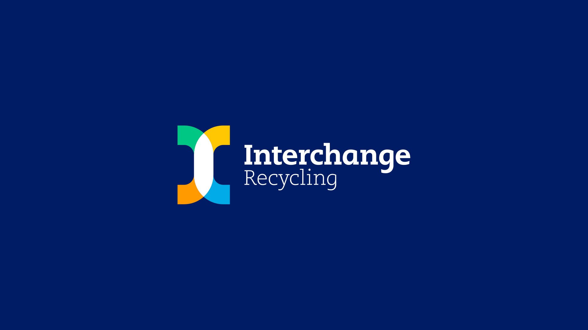
The answer was Interchange Recycling, a name based on the confluence of recycling materials and the exchange of expert advice. The new name became a springboard for design ideas to express the recycling brand in a fresh and relevant way.
The brand identity was manifested through an iconic monogram letter I. The logo itself uses four paths to denote different streams of recyclable materials. Next, vibrant colours were used to get attention, leave a lasting impression and open up the brand toolbox to more modern hues.
From there the brand was deployed across many channels. Digital properties like the website and social feeds, tangible pieces like portable recycling centres in shipping containers down to the simplest pen or business card were all overhauled. Finally, an ad campaign through digital, social, outdoor and television all played a part in launching the Interchange Brand.
Now, Interchange Recycling is ready for new materials and locations, offering better environmental outcomes for all. They've become leaders by embracing change and turning recycling into an adventure worth embracing.

David Lawes, CEO
“The rebranding process was not only seamless and successful, but insightful and fun. They got to the heart of our association and how our new brand will serve our future needs.”
Kelly Duran, Communications Director


